• Summary
• UI Makeover
• Administration Feature
• Before & After Comparison
• Web-Based Application
• Information Design
• Instruction Design
• PC Application
• Qualifications
|
 |
Before & After Comparison |
 |
 |
 |
 |
 |
 |
| |
|
|
|
|
| |
The following shows the redesign of Connected DataProtector, later renamed Connected® Backup/PC.
When creating the initial designs, I took the goals of eight personas into consideration, along with the product requirements. I reviewed the designs with the feature team and usability tested initial design concepts using paper prototypes.
Samples include:
|
|
| |
|
|
|
|
 |
 |
 |
 |
 |
| |
|
|
|
|
| |

Summary Before & After |
 |
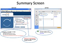
Summary Screen
The original version of the Summary screen displayed text that was hard to scan. Since open file handling was not integrated with the software, full system backups often had errors, which then caused a flashing BACKUP WARNING! message to appear. This message was a source of many support calls.
In the redesign, our main goal was to reduce the likelihood that an error would occur by integrating with an open file handler. In addition, screen text is segmented to promote scanning. If errors do occur, the Summary provides a View Details link, which displays the log.
|
|
| |
|
|
|
|
 |
 |
 |
 |
 |
| |
|
|
|
|
| |

Backup Set Before & After |
 |
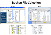
Backup Set Screen
The original version of this screen used non-standard icons such as half blue folders and red Xs. The new design is more consistent with Windows Explorer. Based on usability testing various icons, we selected the triangle icon to represent a mixed selection state (a folder that contains both files selected for and excluded from backup). |
|
| |
|
|
|
|
 |
 |
 |
 |
 |
| |
|
|
|
|
| |

History Before & After |
 |
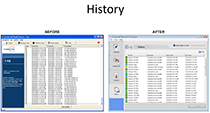
History Screen
The log summary in the original version took time and effort to decipher. In the new version, I improved the this view by making the outcome more clear, adding icons that enable the user to see the results at a glance, and reducing the jargon.
|
|
| |
|
|
|
|
 |
 |
 |
 |
 |
| |
|
|
|
|
| |

History Details Before & After |
 |
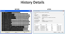
History Details
In the original logs, any errors or warnings were buried at the bottom of the log details. Many users could not find these errors. In the new logs, any errors will be listed at the top. (In the image to the left, if errors had occurred, they would be listed above "Files Backed Up" in the AFTER screenshot.)
The redesigned layout promotes scanning, and brings the key information up out of the noise. It also communicates Connected's data reduction technologies, a key selling point.
|
|
|


